After a flurry of activity (venue! caterer! date!) things have ground. To. A. Halt. We won’t do any tastings or look at rentals until January at the earliest. We’ve kind of started talking about the ceremony and who we’d want to officiate it, but any real decision on that front is a long time coming.
This lull is an opportune time to start plotting/creating the save-the-dates, invitations, and website. I know this. But I am stuck, stuck my friends. I am not a “themey” kind of person, but I feel that a theme is necessary to the overall aesthetic. A brand, if you will permit me to get all corporate on your asses (LYN+BEAU™ INC.).
I am being practical here. It does not make sense to reinvent the wheel every time I go to create each piece. I need to first, you know. Pick a palette. Develop some design elements. Select a few fonts.
*PANIC MODE*
OK. OK. I can do this. I am not even going to worry about the logistics right now. I’m not going to contemplate paper size, type, or weight; or letterpress vs. laser, or postcard vs. magnet. All I’m going to think about is the aesthetic.
Right.
As usual, the internets have yielded some quite excellent examples of other peoples’ invitations. I can’t quite remember where I got them all from anymore, irresponsible blogger that I am. If you see something here that is yours, let me know and I will take it down/attribute it appropriately. But you’re not going to, because you are not one of the three people who read this.
Ahem! On with it, then.

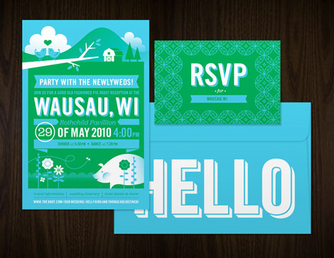
These were the work of Katie Kirk, I believe.
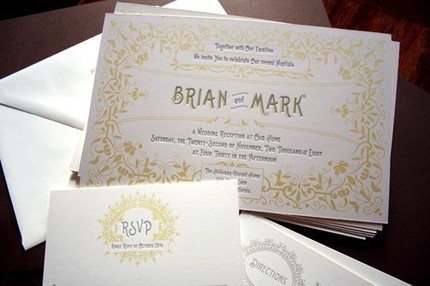
Freaking vintage cute up in here.
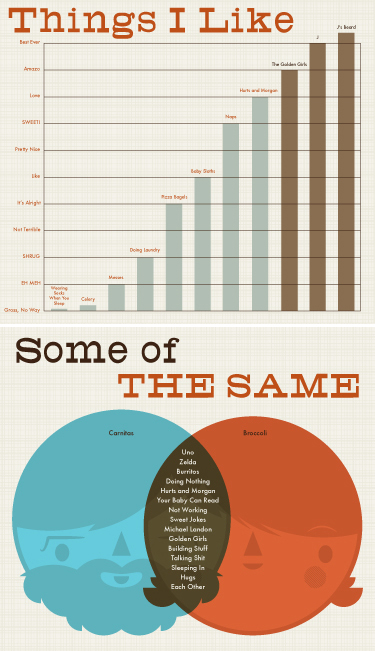
Not the actual invitation, but I like the look.
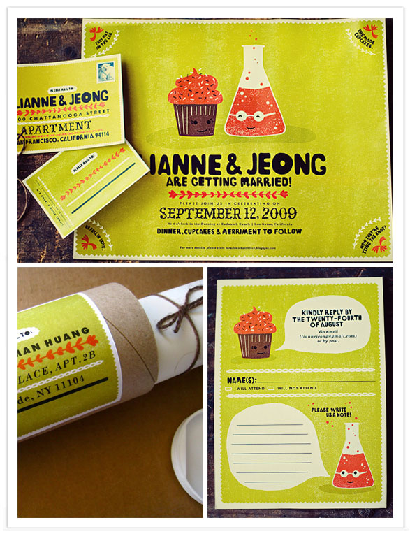
From 100 Layer Cake.
The last one blows me away. The color! The cupcake! The color! The bubbling beaker! The type! The color, dear sweet giant inflated head of Kanye West, the COLOR. Could I do something like that? Could I sum up our personalities via illustration? The beau could be a, a, a piece of bacon, and I could be uhhhhh… a doughnut? Awww. The beau could be the bacon on my maple bar.
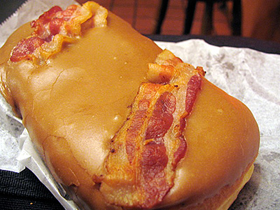
Let us pause in reverent observance of the hallowed bacon maple bar.
Sigh. I have a lot of work to do here.

