Because I did that thing with the invitations recently? And they have finally arrived at the homes of the approximately four people I know who read this blog? Of course I am going to have to show them to you now. As a refresher, this is the part where I go LOOK AT THESE and some of you kind of nod sympathetically and pretend to like them. Then you turn to your friend and go, “I don’t know WHAT she was thinking.”*
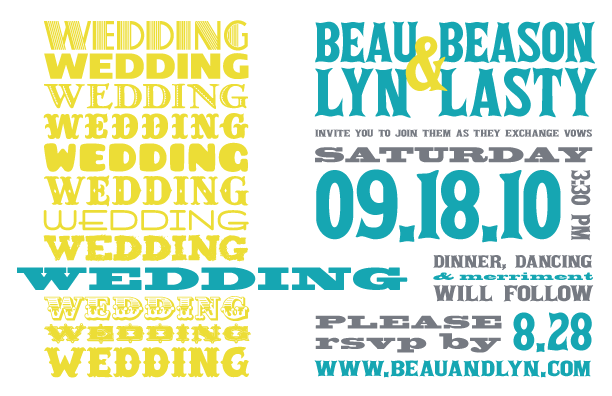
Because my computer is powered by magical unicorns, I was able to change our names and other pertinent info in the source file before making it into a picture. Which is disappointing, because I so wish my fiancé’s name was Beau Beason. Oh well, now I can pretend!
I decided on a typography-based design pretty early on in the process, namely because I had all these FONTS and I LURVED THEM and I WANTED TO USE ALL OF THEM OMG. What? I think that’s a legitimate artistic motive.
I made it so that the big blue word “wedding” is jutting out and attacking the column of information on the right. This is probably some kind of subliminal message about how the wedding is like a dagger stabbing into the heart of my life. Or something.
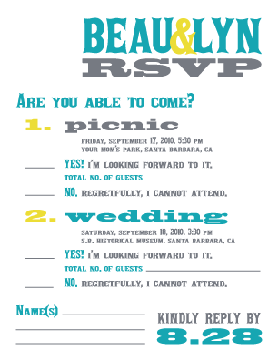
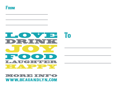
We saved a bit of money by printing out fewer RSVP cards than invitations and sending them only to the older people on our guest list who aren’t as computer-savvy. We made them postcard-sized, slapped a stamp on the back, and sent them on their way. Here’s the front:
I kind of went back and forth about including more information, like the addresses of the venues and a map and directions and a list of hotels with room blocks, but you know what? 90% of our guests are traveling from out of town, and from all different directions. We can’t possibly cover each of their bases. So we just made sure that everything is clearly spelled out on the website, and we let the rest go. No hand-holding. Most guests can fend for themselves from here on out. This is the digital age, after all. All they have to do is click on our Google wedding map and they can build their own directions in a snap. The rest can be helped out by family members.
I got a lot of pushback about this from various people — one told me that assuming her guests would actually bother to visit the website was her biggest mistake. She said she spent the last few weeks before her wedding fielding phone calls from guests who needed basic information. Me? I’m just hoping that our experience is different.
So there it is, folks. Thank you once again for playing along as I show you things you can’t possibly be remotely interested in.
Did you or do you plan to do your own invitations?
_________________________________________________________
* After I mailed out the save-the-dates, I asked my mom what she thought of them, and she said, “Well… they are… interesting.” Yes, mom. They are incredibly interesting. Thank you for noticing.**
** ALSO: OMG, the invitations look nothing like the save-the-dates! I am surely going to wedding aesthetic hell for this.


Oh, I love love typography based designs!! You did an awesome job, and I suspect I will also have not matching styles since my taste is all over the place. The idea that people wouldn’t go to the website to get info would really irk me. I might do an age cut off, like if you’re older than 60 you’ll get an rsvp card and directions but otherwise you should be expected to figure this out on your own. I have better things to do than answer the same question 100 times (I may not be the most gracious hostess under stress…)
These are awesome! Like really awesome:)
And our thank you cards, save the dates and invitations all don’t match. And our menus and programs will probably be completely random, too.
Guess we won’t be getting a Style Me Pretty feature on our wedding, either.
Whoa! After lurking here for awhile I JUST realized that you and I are getting married on the same day!
OMG! Wedding Sin! How can your Sa’s The Da’s (That’s all Lizzie) not match the invites!!! Jk. I love them! Invites, taters, STDs and all!
And this- “This is probably some kind of subliminal message about how the wedding is like a dagger stabbing into the heart of my life. Or something.” Is fantastic.
So far, our website has kicked major ass. (BUT! I do love your idea of sending RSVP cards to those who are not as digital as we are. Love that idea.) So I believe your experience will be a good one. We’ve had a few phone calls/texts asking “How much is the hotel again?” To which we reply, “The hotel is $$$ a night and you can book it through our website at ReadTheDamnWebsiteBeforeCallingMe.com. We have other info there too.” Sadly, what I’m most disappointed about is folks not using our non-profit registry. 🙁 We haven’t gotten a single donation…..
I have had a crush on the wedding invitations that look like music posters since I started wedding research. I love that you took that and had even more fun with fonts and color. YAY!
And yes, you will be fielding calls, both because people can’t handle RSVPs or websites. But just plan it in, and oh well. Send out a follow up email with a link and pertinent info to help. That’s what all my friends have done anyhow, whether they went the online-only route or not. (And, for what it’s worth, I always use the websites. But I’m always online, so there you go.)
1) I think your invites are all kinds of awesome. I really like the different fonts.
2) At first I missed the part where you said you made up names and I was thinking, “how cool, they’re like soap opera characters!”
3) Just as another data point, we didn’t do any hand-holding, just a link to the googlemap directions on our website. And we didn’t have any issues with people finding the place (which is crazy, because it’s tucked out of the way).
4) Ha! we skipped STDs, but I joked that Martha would have my head for using different fonts and colors on everything. Our theme was “nothing matches.”
Best theme ever!
The most asked question in the two weeks leading up to our wedding was “um, so what was that website again?” Come on people. Really? Also, we definitely received an RSVP card AFTER the wedding. Like, it was MAILED after the wedding. Guests are super awesome, and I love them all.
Your invites are awesome. I love the fonts and the colors, and I love that you did it yourself. I’m only a wee bit jealous…
Very nice! I’m so impressed when people design their own amazing looking stuff from scratch (I think you get paid to design stuff right? maybe that’s why you can do this without going into paralyzed and obsessive panic like I would).
As for people using the website – yeah they probably don’t. I’m not totally sure how much ours was used (we got too busy to track it much) but about half RSVP’d on it (the other half just told us they were coming). And as for directions – we left that out of the invite mostly as well and luckily people do figure that kind of stuff out all by themselves. But we did get lots of questions about the registry, which was (as politely as possible) posted and linked to on the website. So yeah, get prepared for some of that.
And yay!! just looking at your invite makes me excited for you – it’s going to be a great party 🙂
Oh, I love those invitations! So pretty. If I had the balls, I probably would have gone with a typography-based design similar to that but I can’t say that my creative veins run that deep. So I’ll just live vicariously through you for now.
And good call on including the info on the website instead of squeezing it into the stationery. With people coming from everywhere, it makes sense to keep it centralized. Plus, people may lose direction cards, but a website is pretty hard to misplace. Kudos.
those colors are AMAZING!
That comment from your mom … It must be universal because I swear my mom has said that about several of our wedding plans.
Parents just don’t understand.
These look fantastic! We are making a start on ours tonight – currently we have card and two vague ideas. By tomorrow we will probably be in the same position. Damn.
Yep, these are awesome! Even if you had to go through Printer Hell and back… look how GOOD they look. Congrats.
LOVE it – jealous I didn’t think of a typography design, per se, even though we had some different fonts going on for our two invites (two receptions!)
AND we picked the exact same colors, cool, no? Ours is 10.3.10 in San Diego, so apparently we’re riding the same wedding frequency…
http://insideouthappy.com/2010/07/28/guess-whats-all-done/